Ok, so I really enjoyed writing the last YA Trends post, so I thought I’d do another one.
This one’s about covers!
Cover Trends Aren’t New
 If you’ve been in the YA game for more than a couple of years, you’ve probably seen a cover trend. It used to be the girls with half a face. Or girls in big ball gowns, even if that didn’t fit the story at all. Or the minimalist covers of like, dandelion fluff or a shoe on the side of a road.
It’s just that now, we’re starting to get more into the cartoon-looking covers. And they kind of drive me crazy.
What are “Cartoon Covers”?
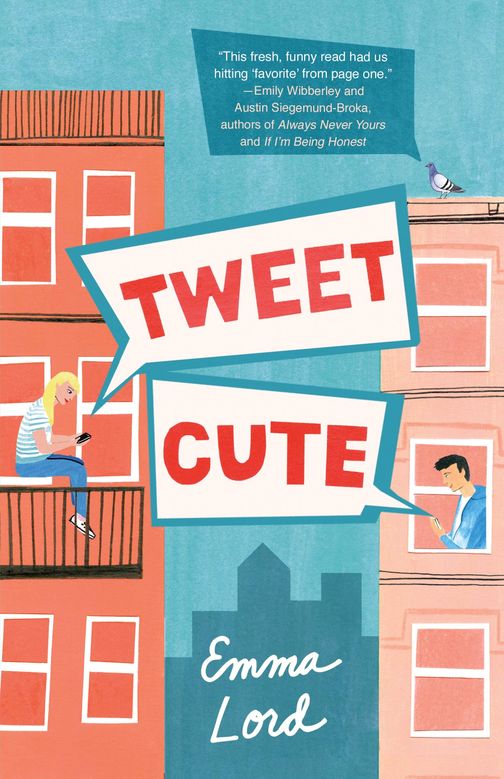
I’m sure there’s some kind of technical term for these covers, but they look like computer-generated cartoons to me, like someone was just messing around and made fan art of their favorite character(s) in the story. Or like they’re trying to Disney-fy everything. It does have a distinctly innocent, Disney look to it.
 And this trend is everywhere, but most prevalent in the YA romance category.
To do some research for this, I opened a Goodreads list called 2020 Anticipated YA Romances. Even I was shocked when I saw that the first 11 books on the list employed the look I’m talking about. Only about 18 out of 71 of the YA romances on this list did not use this cartoonish look. That means about 75% of them did.
I understand this is not scientific in any way, shape, or form. But as an informal survey, it’s incredibly enlightening to say the least. I mean, I didn’t even realize it was that common.
Why is this taking over?
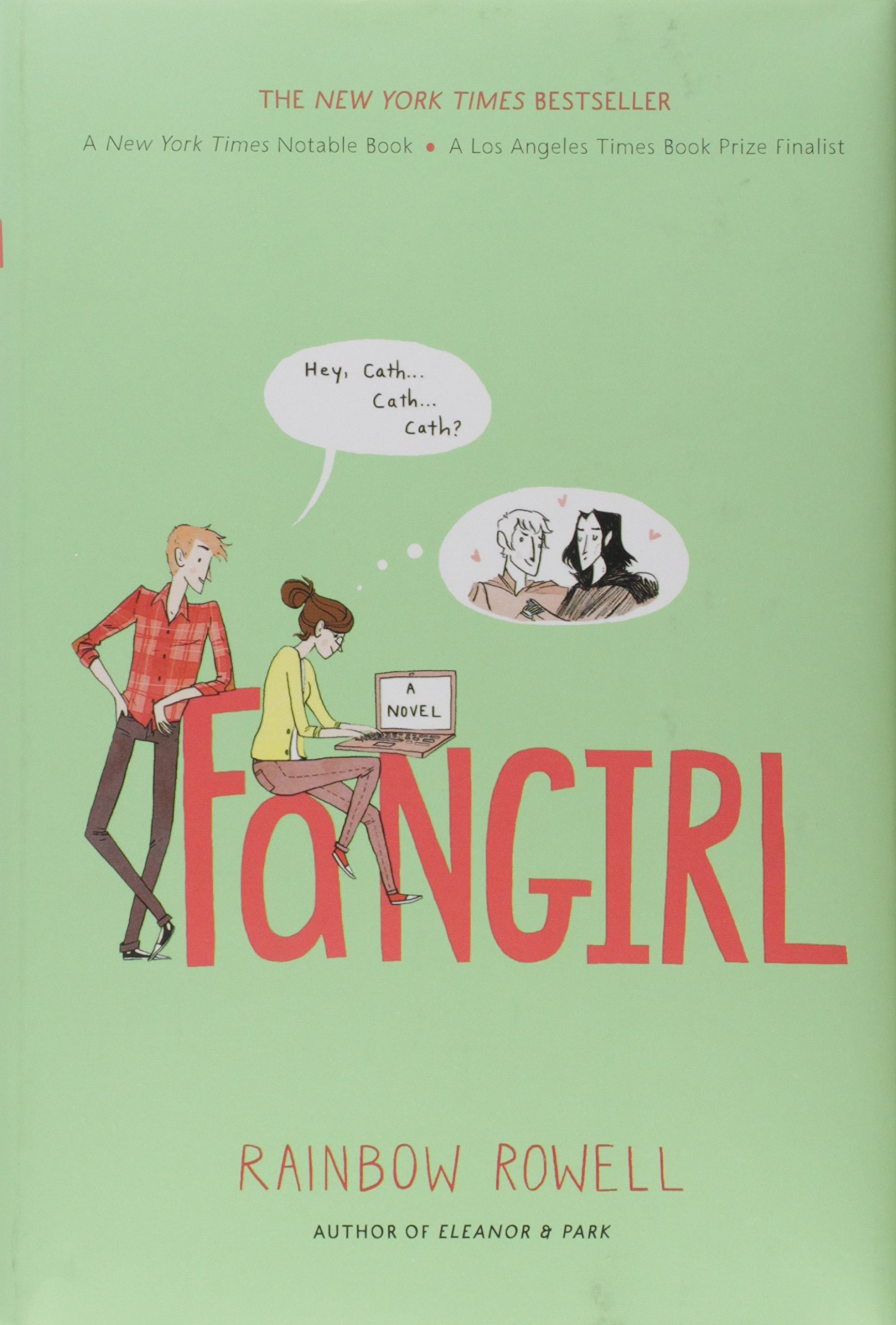 As with any trend, be it in fashion, movies, music, or books, something sold well and everyone is trying to copy it. I can’t figure out what book started this trend (my best guess is last year’s Red, White, & Royal Blue), but I know that it’s not new. The anthology My True Love Gave To Me from 2014 uses this kind of cartoonish look to depict each of the couples in each story. Fangirl by Rainbow Rowell even employs this same style, though with a few differences. So this isn’t something that just got invented.
The point of covers is to help sell the books. Whatever’s going on in marketing right now must point to the success of this style. Maybe it’s simply that people got bored with the previous cover style and are intrigued by the new style. Maybe this allowed for brighter eye-catching covers. Maybe it was “easier” to highlight diversity instead of finding models to fit the look. (I can’t help feeling that this somehow plays into it. I could just be cynical, but it’s ironic that the moment stories start getting more diverse, you suddenly don’t have real-life models on the covers anymore.)
What’s wrong with it?
Besides what I just mentioned about not truly depicting people of diversity in any real capacity, my issue with this is that it seems to trivialize the stories because they’re “just romances” or they’re “for girls.”
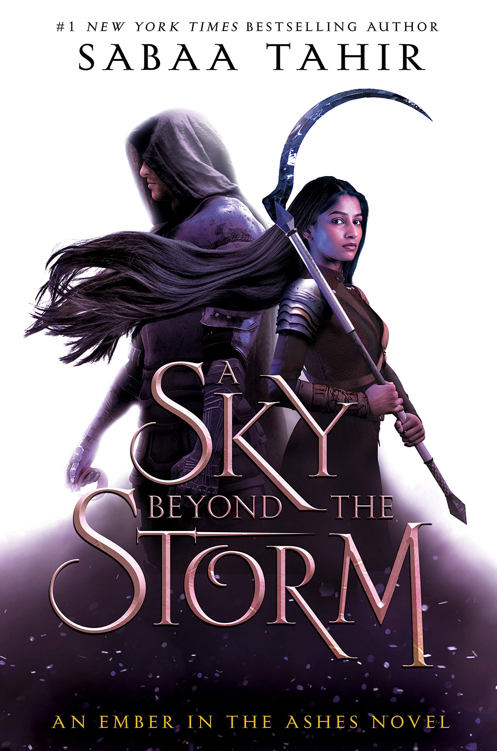 Compare, for example, the types of covers you’re seeing coming out in other genres that are marketed for boys or mixed audiences. Sabaa Tahir’s newest, A Sky Beyond the Storm, is a fantasy novel with a very strong multicultural girl on the cover. The Hunger Games prequel, The Ballad of Songbirds and Snakes, has a gold emblem on it that reminds me of Katniss’s mockingjay pin. Rick Riordan’s The Tower of Nero involves a battle scene on the cover. Karen M. McManus’s upcoming release, The Cousins, has family pictures with giant red X’s through the faces.
None of these are as cartoonish as the romance novels. Even the ones that are computer generated (Riordan, maybe Tahir) still make their effects look lifelike and three dimensional. The cartoons don’t even do that.
Obviously, I realize that romances are supposed to mostly be light and fluffy reads. They use the covers to immediately tell the audience that these books are different than, say, McManus’s mystery or Tahir’s fantasy novel. Covers are very indicative of genre. It’s intentional.
 However, I just balk at the idea that romances are nothing but fluff. Yes No Maybe So by Becky Albertalli and Aisha Saeed was one of my heaviest reads this spring–and yet it’s given a cartoon cover to emphasize the romance of the story rather than its political edge. You Say It First by Katie Cotugno is another with a political edge and a cartoon cover.
Breath Like Water by Anna Jarzab deals with a wannabe Olympic swimmer who might be losing her career if she can’t force herself past her edge.
American Royals and the sequel, Majesty, by Katharine McGee are full of people with the weight of the world on their shoulders, social media vitriol, and manipulations from every angle.
 The Life and (Medieval) Times of Kit Sweetly by Jamie Pacton is about a waitress at a medieval-themed restaurant who disguises herself as a knight to join the joust–something that only the guys can do. And Kit isn’t going to let the bosses say a girl can’t do it.
Don’t Read the Comments by Eric Smith is about a professional gamer using the money she makes to help her mother pay the rent and internet trolls who are now threatening her in real life.
But yeah, sure, let’s just focus on the romance in these and give it a cute, poppy cover that don’t highlight at all that there’s more depth to the story than that.
I hate the misconception that romance is just about the love stories and that’s it. That’s like saying Titanic is just about Jack and Rose when there’s so much more to the story than that. Do they have romantic elements? Yes. But something like The Hunger Games also has a very obvious romance in it as well and that’s de-emphasized to highlight the action.
Last Thoughts
Like any trend, this will probably only be around for a year or two and then start to disappear. It’ll be something new before we know it. It just bothers me that this is so pervasive at the moment and that it seems to be impacting diversity disproportionately. From the covers alone, you’d never be able to tell how multicultural they are. That seems to be intentional to “broaden the appeal”; however, it just perpetuates the problem.
I’ll get off my soapbox now. I’m just hoping we can get to a point again where we can acknowledge that YA romance is about far more than romance.

Pingback: May 2020: Monthly Wrap-Up – Lavish Literature Book Blog